
A powerful one-page site is all this cyber security consultant needed
We built Secure Hive a full brand identity and single-page site that positions Brandon as the authority he already is.
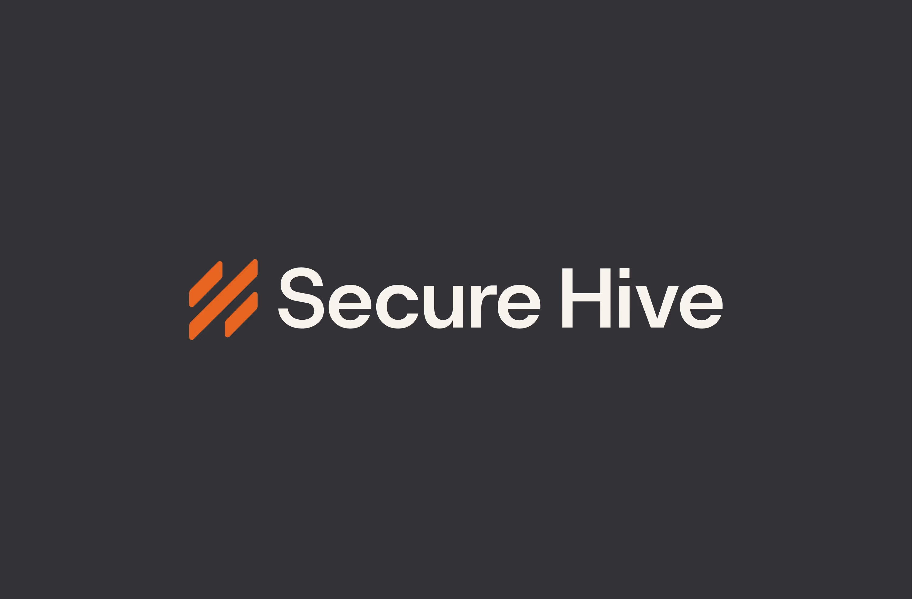
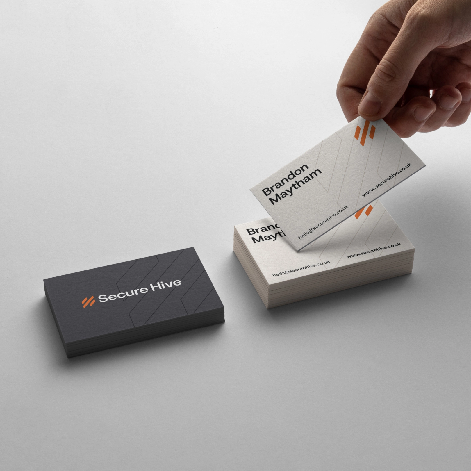
Secure Hive
Engagement
Location
Services
Migration
Awards
The Challenge
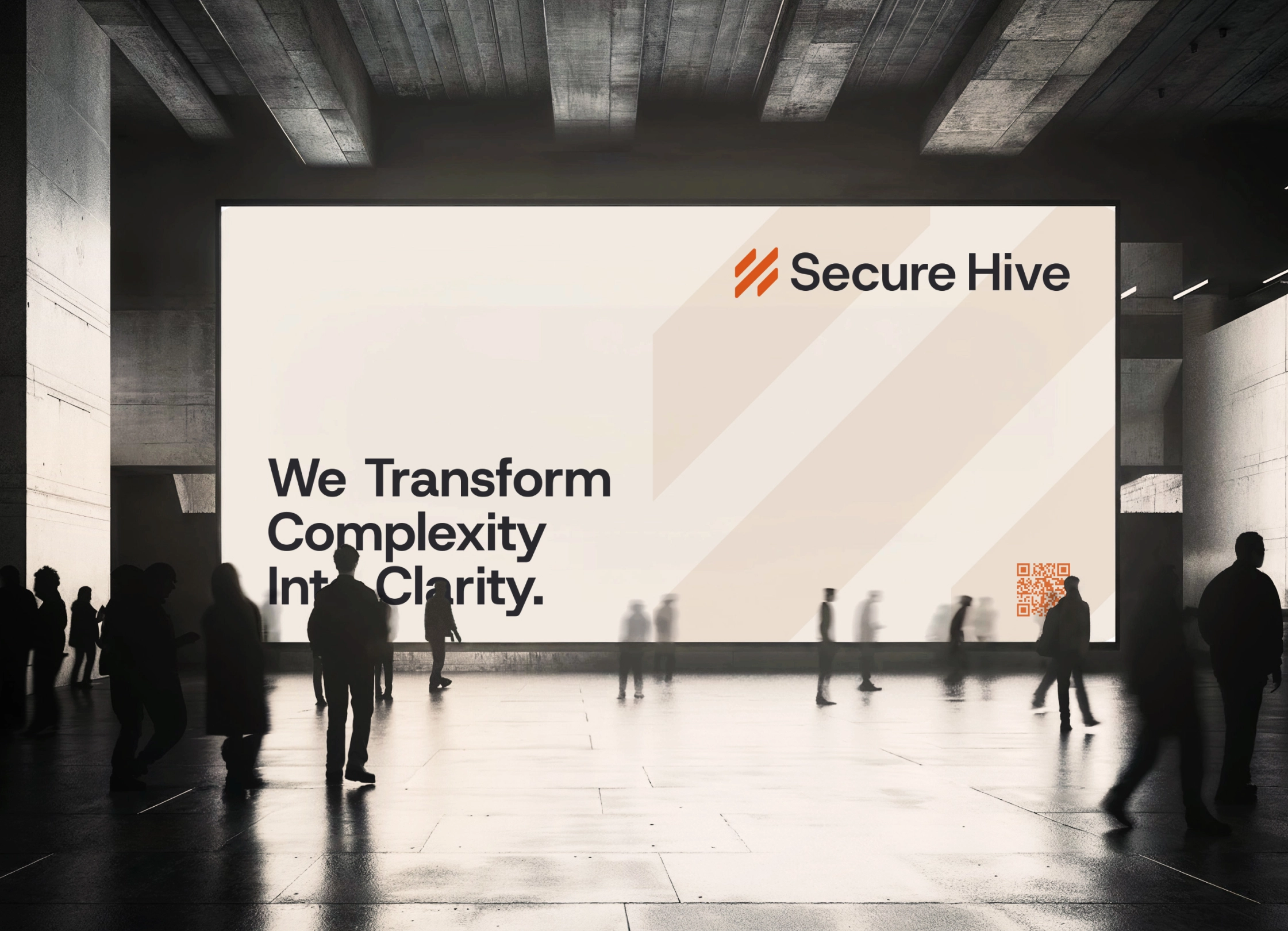
Brandon was already doing serious work. But his pipeline ran through Upwork, where there was a hard ceiling on how you're perceived and what you can charge. There was no brand or solid web presence to sell his expertise and blueprint library. Upwork was doing the positioning for him, and he wanted to be able to do more. He came to KHULA knowing it was time to build something that reflected where he was actually operating as a vCISO.


.avif)
The Outcome
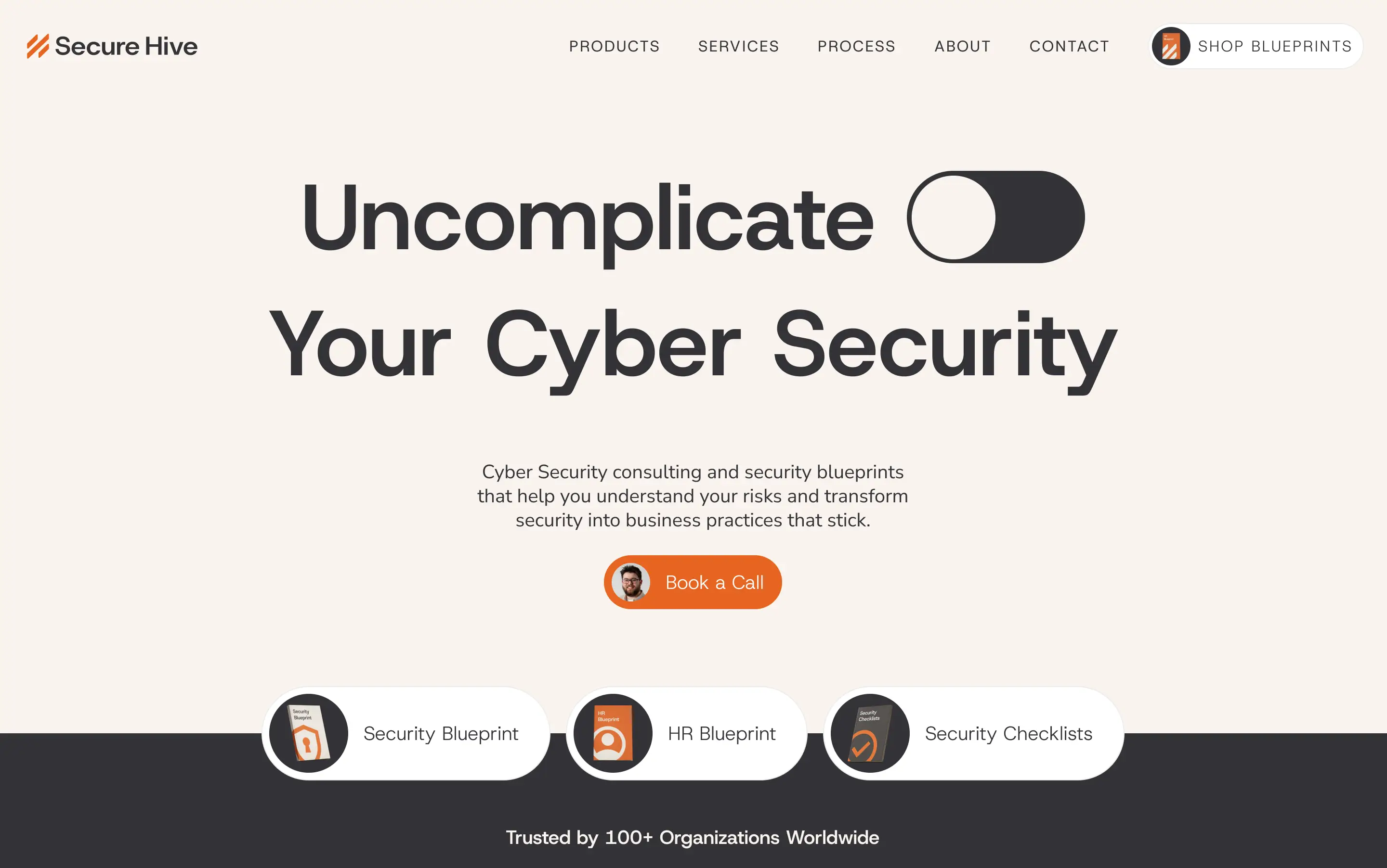
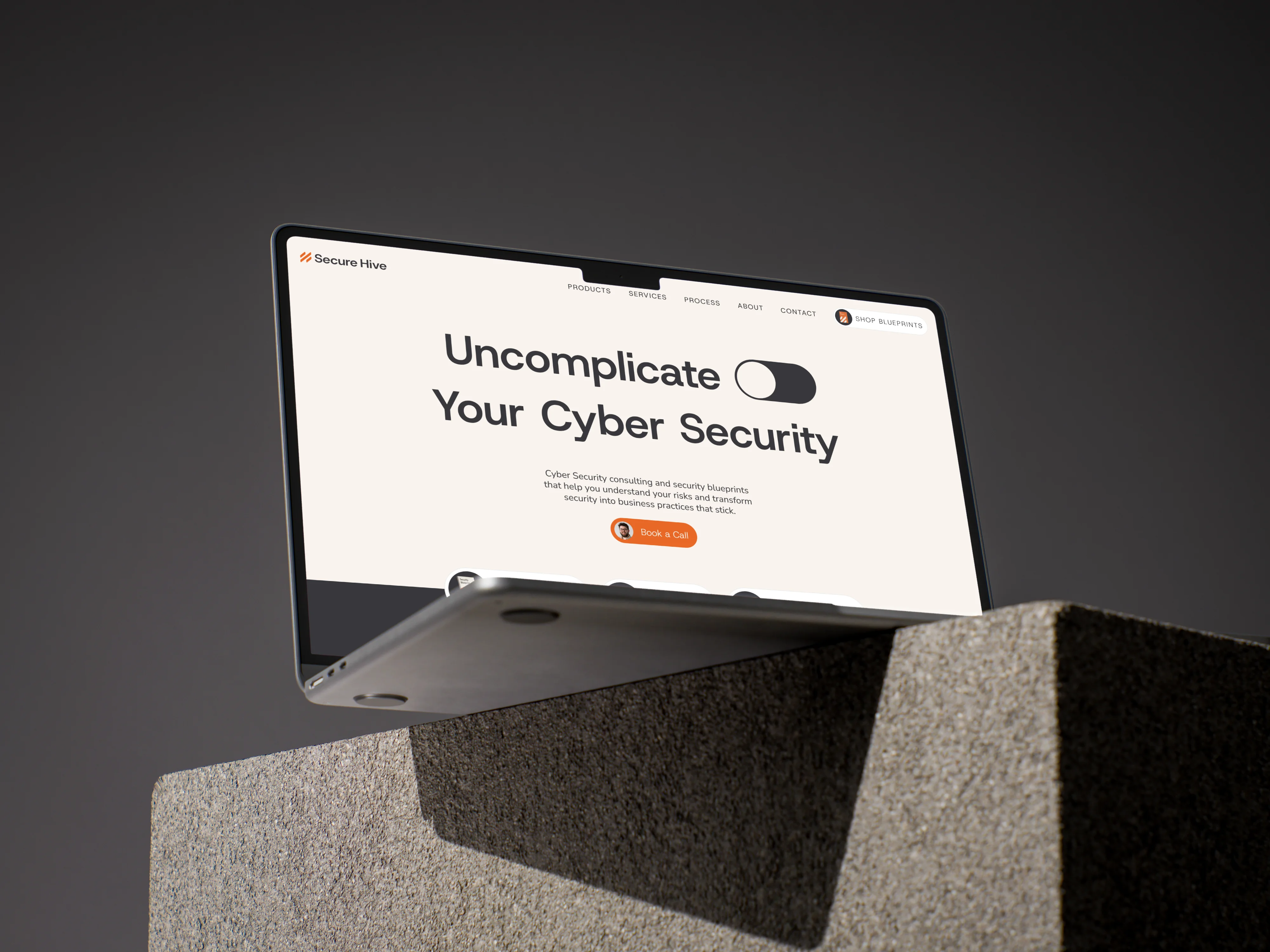
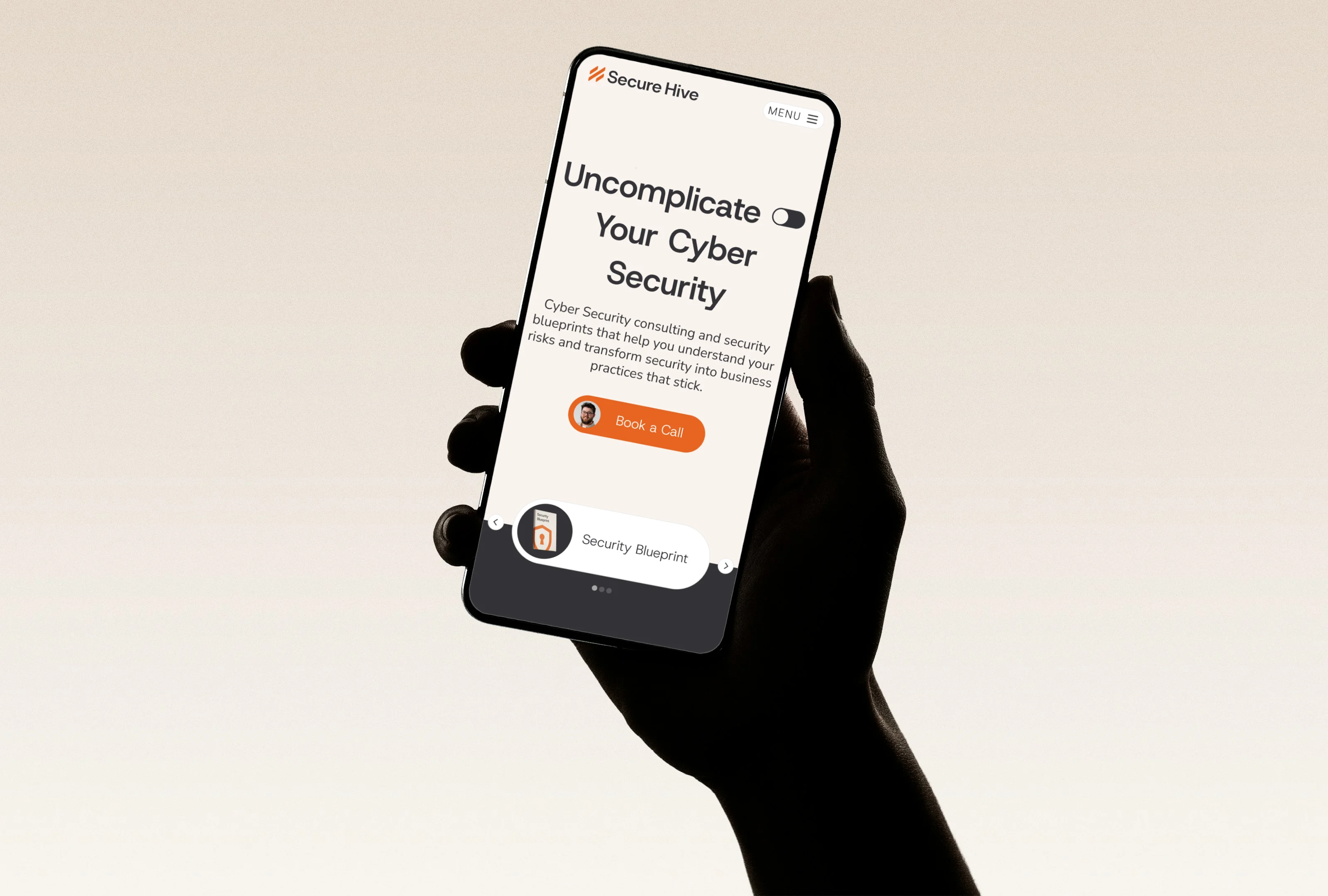
We kicked off by building a brand: defining the positioning and visuals that would capture attention in the cyber security space. Once we had designed a logo, and full brand identity system, we ran with designing a dynamic single-page Webflow site built to move fast and convert. The site establishes Brandon's authority immediately and integrates a direct purchase flow for his blueprint library, turning his years of expertise into a sellable product. Secure Hive now has a presence that he owns, working for him 24/7.
Leveling Up Looks Like This

“Working with Jamie was one of the best decisions I made for my business.
What he did wasn't just design work. It was translation. He took everything I was trying to say about my business, stripped away the noise, and handed it back to me in a form that actually makes sense to people. That's harder than it sounds. Most designers make things look good. Jamie made things feel true.
The visual identity he built doesn't just represent the business. It connects. It taps into something emotional before a single word is read. And when the words do land, they're clear. No jargon, no over explaining. Just the right thing, said the right way.
The one-page website is the clearest example of this. Everything someone needs to understand what I do, why it matters, and what to do next is all in one place. No hunting around, no confusion. Just a clean, powerful experience that does the job.
If you're building something and need someone who can see past the surface of your business and translate its real value into design and words that move people, Jamie is the person.”
Brandon Maytham
Photography & Drone Videography
Next Up
Got Questions? Chat with Jamie.
