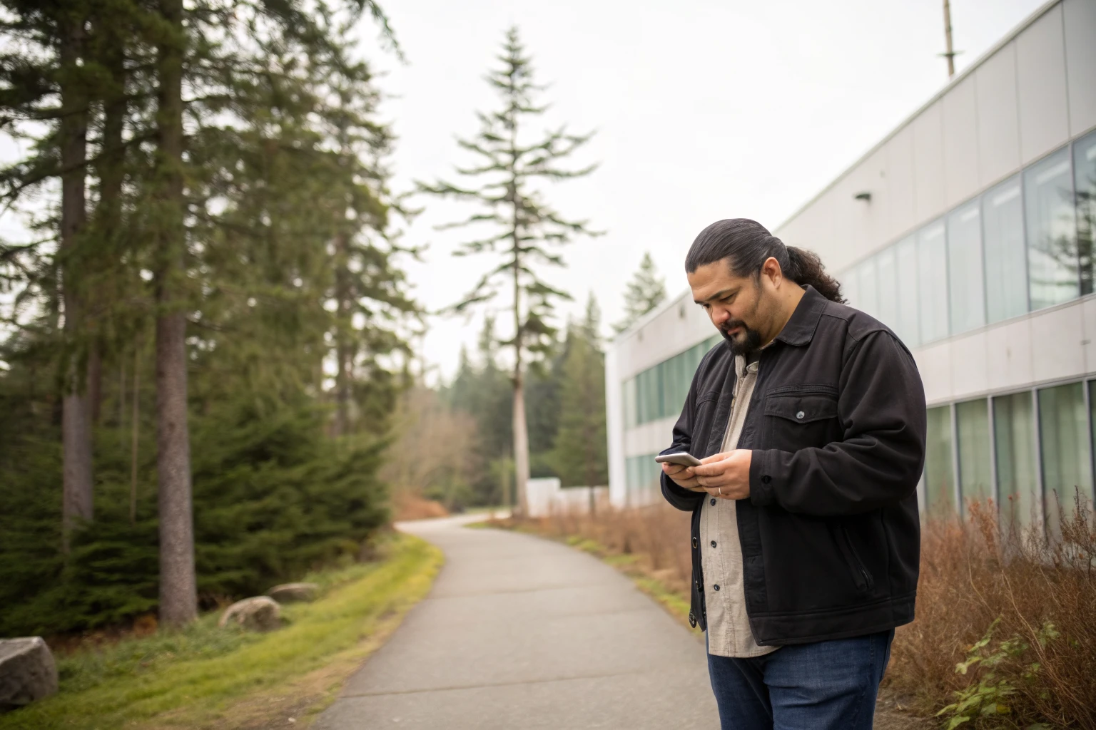
Ask most band offices what their website is for and the answer is something like "so people can learn about us." Ask the reception desk what actually happens, and you get a different answer: the phone rings all day with the same questions. When is the next general meeting. Where do I get a housing application. Who do I talk to about education funding. Can you email me the financial statement again.
That gap is the whole problem. A Nation's website is not a brochure. It is a service channel, and most of the people using it are members trying to get something done.
Design for the task, not for the visitor
A brochure site is organised around how the organisation sees itself: About, Departments, News, Contact. A service site is organised around what people came to do.
The most useful exercise we run with a Nation costs nothing. Ask the front desk and the department administrators to list the questions they answer most often in a week. You will usually get a list like this:
Forms and applications: housing, education funding, status cards, membership, employment.
Dates: general meetings, elections and voting, community events, office closures.
Documents: financial statements, annual and performance reports, meeting minutes, band council resolutions.
People: who leads which department, and how to reach them directly.
Services: health, social development, education, lands and housing, and what each one can actually help with.
If a member cannot get to any item on that list within a minute of landing on the homepage, the website is adding work to your staff's day instead of taking it away.
Most of your members are on a phone
This is not a guess you need to make. Check your analytics and you will almost certainly find mobile traffic well ahead of desktop, and the gap is usually wider for a Nation's site than for a business site.
Mobile-first is not just about things fitting on a smaller screen. It means phone numbers that dial when tapped, addresses that open in maps, PDFs that are readable without pinching, forms that can be completed on a phone rather than printed, and pages that load on a connection that is not fast. A site that is only comfortable on a desktop in the band office is a site that works best for the people who need it least.
Accessibility is a community issue, not a compliance box
Your membership includes Elders, members with low vision, members using older devices, and members who read English as a second language. Accessibility is simply how you make sure the site serves all of them.
The fundamentals are not exotic: real text rather than words baked into images, colour contrast that holds up in daylight, a sensible heading structure so a screen reader can move through a page, descriptive link text instead of "click here", captions on video, and text that can be enlarged without the layout collapsing. We covered the detail in our guide to making websites accessible, and the short version is that these are design decisions best made at the start, because retrofitting them later costs several times more.
Member portals that members actually use
Gated areas fail for predictable reasons. The login is buried, the password reset does not work, the content behind it is out of date, or the portal is so complicated that members give up and call the office anyway.
A portal is worth building when there is genuinely member-only content: personal documents, restricted reports, voting material, or applications tied to membership. When we built the members-only area for Ch'íyáqtel First Nation, the goal was straightforward — put the restricted material somewhere members can reach it themselves, so the administration team is not emailing the same documents over and over. The rule we apply is simple: if information does not need to be restricted, do not restrict it. Every login you add is a barrier, and barriers cost you the members who most need the information.
Your staff need to be able to update it
Nothing erodes trust in a website faster than out-of-date information. A member who finds last year's meeting schedule twice will stop checking the site and start phoning.
That is a content management problem before it is a design problem. When we rebuilt the site for the Stó:lō Service Agency, we structured it with flexible CMS blocks specifically so their team could keep resources current in real time, without a developer and without risking the layout. If posting a notice takes more than a couple of minutes, it will not happen consistently, and the site will drift.
The story belongs there too
Being useful and being meaningful are not in competition. The practical material is what members come for, and the history, language, territory, and work of the Nation are what make the site feel like it belongs to the community rather than to an administration.
The Stó:lō Collective site is the clearest example we have of this. The redevelopment at Pekw'Xe:yles needed to be explained to members, to partners, and to the wider public, and it needed to hold the history of the former St. Mary's Residential School site with care. An interactive timeline and cinematic visuals did what a page of text could not.
Real imagery matters more than most people expect here. Photography and drone footage of your lands, buildings, and developments will always say more about a Nation than stock photography, and it gives every page something true to sit on. It is part of what we do on our photography and drone videography service.
How to tell whether it is working
You do not need a dashboard to measure this. Three signals tell you almost everything:
Reception is answering fewer repeat questions, because members are finding the answer themselves.
Form and document pages are among your most visited pages, which means people are reaching the material they came for.
Staff are publishing updates without asking anyone for help.
If those three are true, the site is doing its job. If they are not, the issue is usually structure and content ownership rather than visual design.
Start with one department
You do not have to rebuild everything at once. Pick the department that fields the most repeat questions, usually housing or membership, and get that section right: the forms, the contacts, the dates, the documents. Then apply what you learn to the rest.
We have done this work alongside Nations across the Fraser Valley, and you can see more of it on our First Nations page. If you want a straight assessment of where your current site is getting in your members' way, reach out and we will walk through it with you.